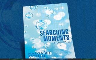
 Cover design is an important aspect when publishing a book, and it is something all authors struggle with. We talked with Cover Design Supervisor Alison Holen to gather advice and insight from an experienced cover designer. The image for today’s entry is an example of Alison Holen’s work.
WBP: Why is a good cover design important to your book?
AH: Although it is often said, “never judge a book by its cover,” readers rarely follow this saying. A well designed book draws the eyes and sparks the reader’s curiosity. A quality cover design also brings a sense of professionalism to a book.
WBP: Where should an author start when thinking about a book’s cover design?
AH: When thinking about what direction to take for cover design, you need to begin by looking at the future of the industry: online bookstores. Online bookstores present an interesting challenge to a designer because the images used to represent the book online are rather small (thumbnails). In this instance, bold typographic design with a simple (yet powerful) image is typically successful because it is easier to view at a smaller size. As long as the design is strong at the thumbnail size, the cover will be even more impactful on the shelf of a store.
WBP: What are the primary components an author should consider when thinking about their book’s cover design?
AH: First they should think about the title. When people hear the title, does it stick with them? Authors want to make sure that their title is clear and concise so that the designer is able to create a professional layout. You want to ensure that the title relates to all aspects of the work; you don’t want to confuse potential readers on what the topic of the book is.
All text on the cover should be kept short and to the point. The front cover should only have a title, short subtitle (giving a little more detail to the book’s topic) and pen name. A brief endorsement is also a possibility.
When thinking about imagery it is important to keep it simple. One of our designers’ main tools for designing stunning covers is stock photography, and it can be next to impossible to find a perfect match for an extremely detailed idea.
Authors should also take time to think about the message of the book, and use it as a way to come up with a strong visual symbol for the cover.
WBP: Is there a universal hierarchy of the elements of a book cover that authors need to know?
AH: The importance of the different elements changes with the genre of the book, but there are always exceptions. A standard hierarchy typically has the title as the most prominent feature with a slightly smaller subtitle. The pen name should be after the subtitle, and the imagery should draw the reader’s attention without being the most important aspect of the cover. A well designed title should be able to stand alone and grab the reader’s eye.
WBP: What are some guidelines for selecting an image for your book’s front or back cover and does the genre of the book make a difference?
AH: Let the reader use their imagination – don’t give them too much on the front cover. You should give them just enough to want to open the book and read more. It is important to keep the genre of the book in mind when considering images. You want to focus on an image that can communicate the feel of the book and its genre. For example, if the genre is self-help, it would be best to use a cheerful and clean image versus a dark, brooding image, which is more appropriate for a thriller or horror book.
WBP: How does color play a part in the overall feel of a book cover?
AH: Color can be one of the most important aspects of the cover, and different colors provoke different feelings from the viewer. For instance, if I see a cover with a lot of bright, bold colors I will assume there is something dynamic about the book. Color can convey an emotional tone, and it can draw the eye of the customer.
WBP: What things should an author consider when choosing a font and font size for a front or back cover?
AH: Typography is a tricky thing to discuss without knowing the specifics of a book or its title. A very basic explanation of type is as follows:
Serif font: traditional and serious
Sans Serif font: contemporary and clean
Script font: whimsical or romantic
Handwritten font: children or humorous
There are many exceptions to these rules, and because of this it is best to trust the graphic designer. Graphic designers have extensive training in typography and they are aware of the trends in fonts and how they relate to communicating an idea.
WBP: What are some of the biggest mistakes you see first-time authors make in regards to their cover design?
AH: Many authors want to over-design their cover. Authors tend to get stuck on an idea even though it is not the best way to market their book to the general public.
Typically, the author wants to depict a scene from the book or have their main character on the cover. I try to persuade authors away from using this much detail because the cover should draw a reader in without telling them too much. Reading is such a personal and imaginative exercise and authors should let the reader imagine the characters in scenery in their own minds from their words.
Another common mistake made by authors is that they don’t know what is trending in the publishing industry. One way to know what is happening is to walk through a bookstore or browse an online bookstore. Authors should look at other books in their genre to see what visual standards have evolved to help identify it to readers. It is important for book covers to be current.
WBP: Should authors consider testing different cover design concepts with family and friends before moving forward with a final concept?
AH: It is helpful for any author to get opinions from their family and friends. It is especially helpful to get feedback from people who are most likely to read their book. Having fresh eyes look at a cover design can be helpful because it is easy for an author to miss something obvious because they are too close to their work. Having other people contribute their opinions is can also help an author gain some perspective.
WBP: In your opinion, what makes a good book cover?
AH: If the cover of a book accurately communicates the genre and topic, and if it makes me want to pick it up and read it, then it has a successful design.
Alison Holen is the cover design supervisor at Author Solutions, Inc. She graduated from Indiana University with a bachelor of arts in English literature, and a bachelor of fine arts with a concentration in graphic design. Alison is also the lead freelance designer for Glass Heritage, LLC, where she designs stained-glass windows. She is currently starting a video game company called Giraffysics that focuses on educational, nonviolent games. Alison enjoys hiking in the beautiful rolling hills of southern Indiana and cooking for her friends in her spare time.
Good, practical information…thanks! I have published one book, “Leading People to Christ“ but having difficulty with the title of my second book…a personal story of how God has sustained me through a mother who wanted to abort me, 18 surgeries, heart attack, cardiac death, terrible car wreck, cancer three times, etc. If you offer design services, I would be interested in talking more. Thanks! – Ray
Hi Ray, you are in luck – we do offer Design services!
If you have any questions, please call us at 1.866.928.1240.
Thank you,
WestBow Press
What do you suggest for back covers for novels? A snippet? A synopsis? Any suggestions for back cover designs?
Hi Alana, the back cover of your book is important because book buyers typically spend twice as long looking at the back cover than they do the front cover. Back covers typically use text to pique the reader’s curiosity; it is a critical selling point for your book.
We hope this helps! If you have any more questions, please feel free to contact us at 1.866.928.1240.
Thank you,
WestBow Press